Redesign for Cosmetics Brand
Redesign for Cosmetics Brand
Redesign for Cosmetics Brand
Redesign for Cosmetics Brand
Redesign for Cosmetics Brand
KosMystik

KosMystik
KosMystik
KosMystik
KosMystik
KosMystik
KosMystik
KosMystik
KosMystik
KosMystik
KosMystik
KosMystik
KosMystik
KosMystik

overview
overview
KosMystik specializes in the production and promotion of cosmetics, using Dead Sea minerals as its core component in the products.
KosMystik specializes in the production and promotion of cosmetics, using Dead Sea minerals as its core component in the products.
The feature of cosmetics is a completely authentic composition (products contain all 26 existing Dead Sea minerals, oligo-elements, microalgae extracts, vitamins A, E, and B5, aloe vera, allantoin, antioxidants, olive and almond oils, chamomile extract).
At Tarasenko Branding Agency we handled brand redesign for KosMystik, conducted research into the cosmetics industry, revamped the company's logo, and simplified its geometry.
Services provided:
Research
Logotype & Visual identity
Product Labels
Visual guidelines
Services provided:
Research
Logotype & Visual identity
Product Labels
Visual guidelines


Challenge
Challenge
As the Managing Director of a cosmetics company, I was challenged with resolving the problem of outdated brand design that was not in keeping with the quality of the product.
Nika Nasimov
Managing Director, KosMystik
As the Managing Director of a cosmetics company, I was challenged with resolving the problem of outdated brand design that was not in keeping with the quality of the product.
Nika Nasimov
Managing Director, KosMystik
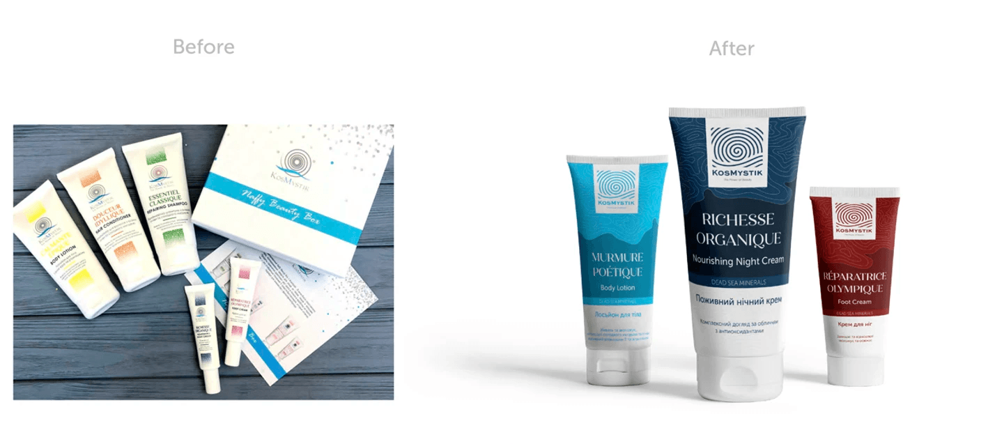
The existing branding needed a comprehensive overhaul, including a revamp of the company's logo and a redesign of all product labels. The goal was not only to modernize the visual identity but also to enhance the overall perception of the brand in a highly competitive cosmetics industry.
The existing branding needed a comprehensive overhaul, including a revamp of the company's logo and a redesign of all product labels. The goal was not only to modernize the visual identity but also to enhance the overall perception of the brand in a highly competitive cosmetics industry.

solution
solution
We undertook a strategic approach to address the challenge.
We undertook a strategic approach to address the challenge.
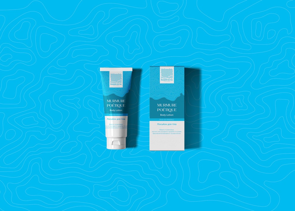
Before diving into the design process, our team conducted thorough research into the cosmetics industry, the target audience, and competitors. We collaborated closely with the client, highlighting the strongest points of the products. Based on these insights, our design team developed an unusual and eye-catching packaging design. The logo underwent a transformation, with its geometry simplified for better perception while retaining recognizability.
Before diving into the design process, our team conducted thorough research into the cosmetics industry, the target audience, and competitors. We collaborated closely with the client, highlighting the strongest points of the products. Based on these insights, our design team developed an unusual and eye-catching packaging design. The logo underwent a transformation, with its geometry simplified for better perception while retaining recognizability.
Visual concept
Visual concept
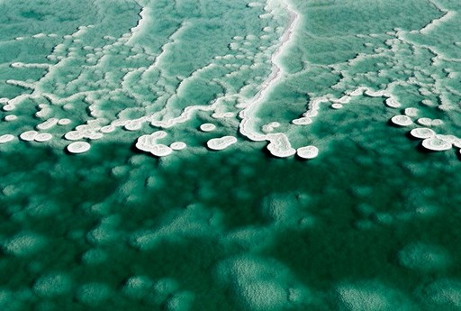
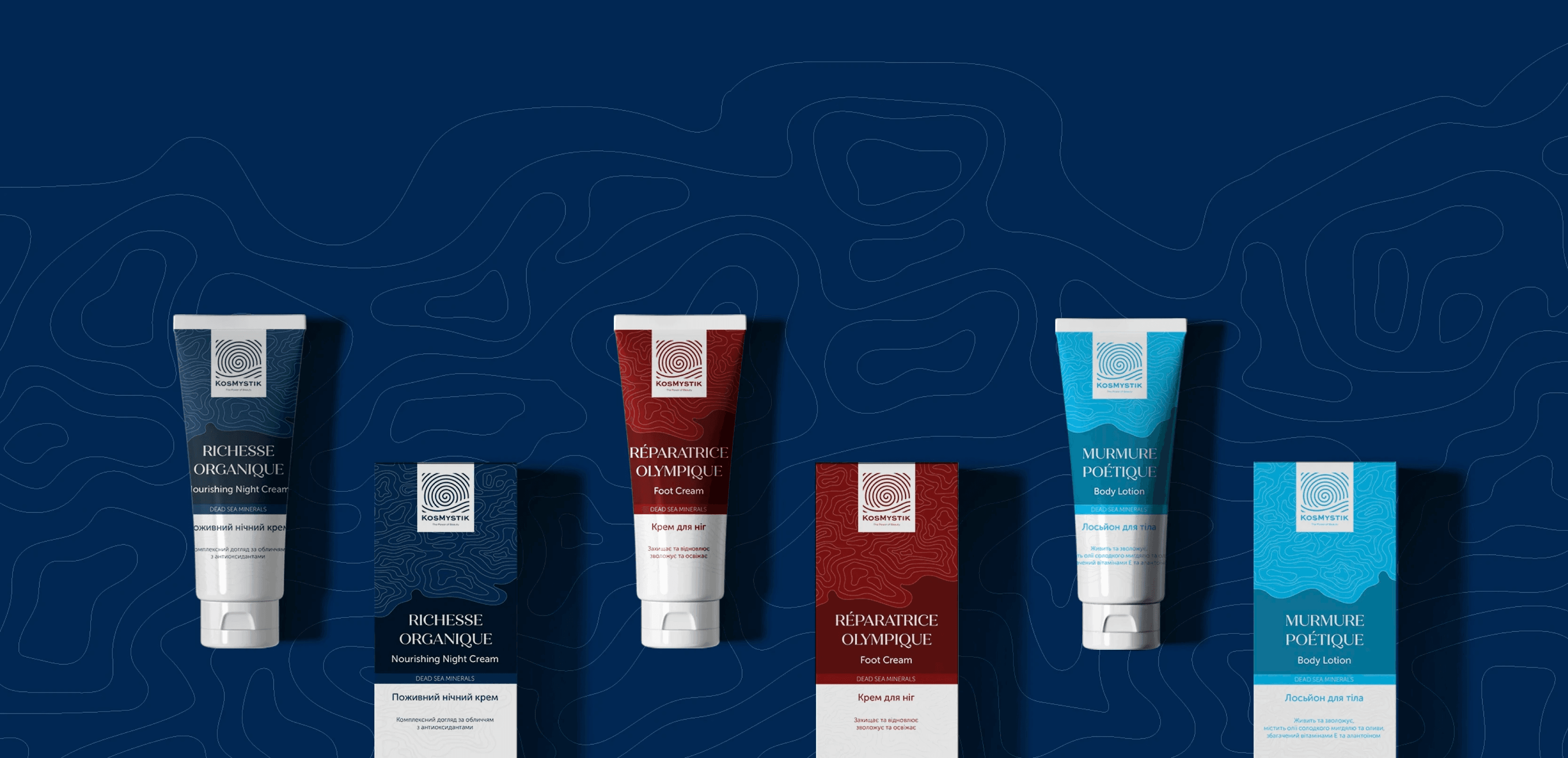
Pattern based on stylization of the seabed.
Pattern based on stylization of the seabed.
The idea of the new KosMystik identity is based on the stylization of the Dead Sea bottom. With the help of lines, we tried to recreate the shapes that symbolize the layering of salts in the form of rounded or oblong depressions characteristic of the Dead Sea bottom.
The idea of the new KosMystik identity is based on the stylization of the Dead Sea bottom. With the help of lines, we tried to recreate the shapes that symbolize the layering of salts in the form of rounded or oblong depressions characteristic of the Dead Sea bottom.


logo concept
logo concept
We kept the idea but changed the form.
We kept the idea but changed the form.
We decided to keep the current idea of the logo because of the good symbolizing of the brand philosophy, but change the way it was realized.
We decided to keep the current idea of the logo because of the good symbolizing of the brand philosophy, but change the way it was realized.
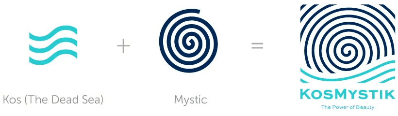
We developed a new form, making it cleaner more minimalistic, and modern.
We developed a new form, making it cleaner more minimalistic, and modern.

typography
typography
Quiche Flare
Quiche Flare
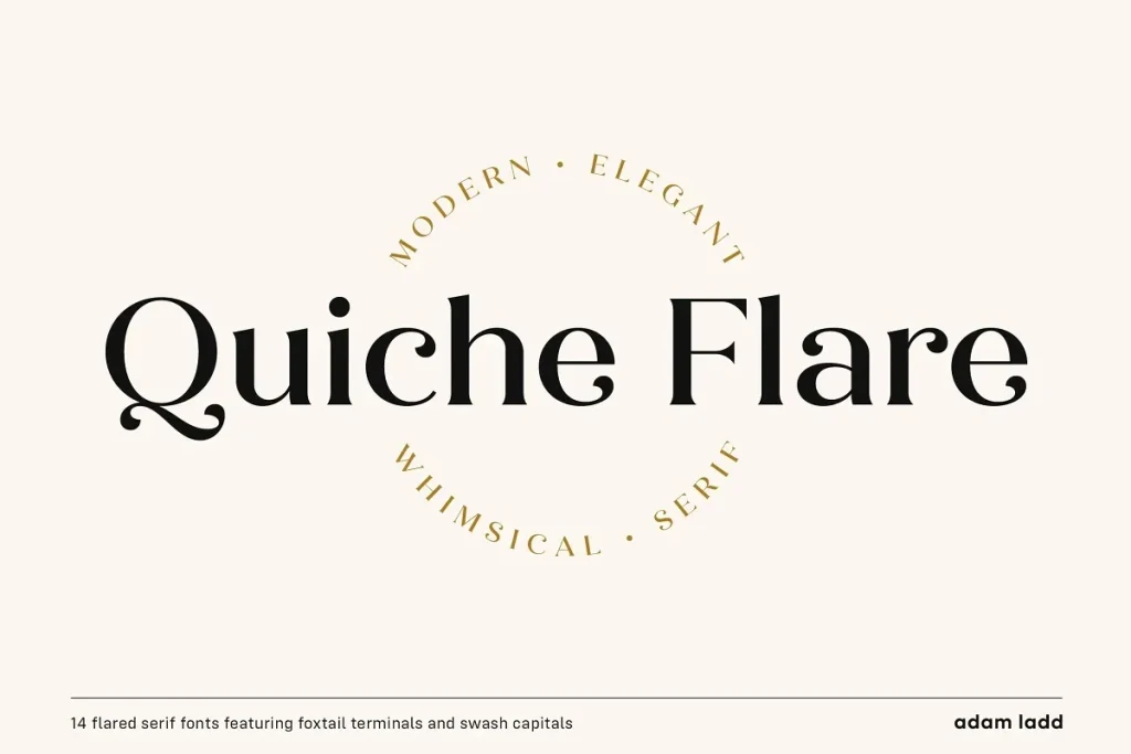

Quiche Flare is a high-contrast, flared serif typeface featuring foxtail ball terminals, swash capitals, and geometric proportions. With weights ranging from Thin to Black with matching italics, it’s useful for a variety of display applications across products, packaging, labels, invitations, stationery, fashion, etc. The design exhibits both elegance and a touch of whimsy with the foxtail terminals and the flared serifs add more interest, beauty, and movement to the characters.
Quiche Flare is a high-contrast, flared serif typeface featuring foxtail ball terminals, swash capitals, and geometric proportions. With weights ranging from Thin to Black with matching italics, it’s useful for a variety of display applications across products, packaging, labels, invitations, stationery, fashion, etc. The design exhibits both elegance and a touch of whimsy with the foxtail terminals and the flared serifs add more interest, beauty, and movement to the characters.
Museo Sans
Museo Sans

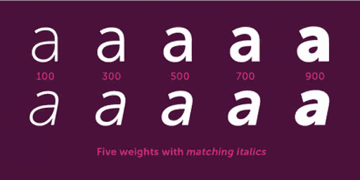
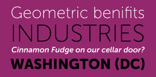
It is a sturdy, low contrast, geometric, highly legible sans serif typeface very well suited for any display and text use. This OpenType font family offers also support for CE languages and even Esperanto. Besides ligatures, automatic fractions, proportional/tabular lining and old-style figures, numerators, denominators, superiors, and inferiors, Museo Sans also has a ‘case’ feature for case sensitive forms.
It is a sturdy, low contrast, geometric, highly legible sans serif typeface very well suited for any display and text use. This OpenType font family offers also support for CE languages and even Esperanto. Besides ligatures, automatic fractions, proportional/tabular lining and old-style figures, numerators, denominators, superiors, and inferiors, Museo Sans also has a ‘case’ feature for case sensitive forms.
Museo Sans Font Family was designed by Jos Buivenga and published by exljbris on MyFonts.
Museo Sans Font Family was designed by Jos Buivenga and published by exljbris on MyFonts.


result
Rebranding opened up new possibilities and enabled the company to increase sales.
The agency successfully crafted a specific visual brand concept that not only modernized the brand but also helped to associate the brand with a premium-level product. The redesigned brand opened up new possibilities and enabled the company to increase sales.
The collaboration with Tarasenko Branding Agency not only resulted in a visually appealing design but also in deep, meaningful solutions that set the brand apart from competitors, emphasizing its uniqueness in the cosmetics industry. The project showcased the agency's efficiency, professionalism, and commitment to meeting deadlines, ensuring a successful outcome for the client.
CLIENT TESTIMONIAL
We've received a high-quality of ideas and their implementation.
Nika Nasimov
Managing Director, KosMystik
CLIENT TESTIMONIAL
We've received a high-quality of ideas and their implementation.
Nika Nasimov
Managing Director, KosMystik
CLIENT TESTIMONIAL
We've received a high-quality of ideas and their implementation.
Nika Nasimov
Managing Director, KosMystik

Menu
Menu
Menu