Logobook for The Energy Supplier Company
Logobook for The Energy Supplier Company
Logobook for The Energy Supplier Company
Logobook for The Energy Supplier Company
Logobook for The Energy Supplier Company
Tepla

Tepla

Tepla

Tepla

Tepla

Tepla

Tepla

Tepla

Tepla

Tepla

Tepla

Tepla

Tepla

Tepla


overview
overview


Tepla – is a supplier of energy resources (gas & electricity) for the public and business clients.
Tepla – is a supplier of energy resources (gas & electricity) for the public and business clients.
We have been hired by a digital energy retail business for logotype development. Our team initially conducted market and competitive research, and then we provided the client with different logotype concepts that all meet company positioning criteria.
Are you wondering about the result? Let's dive into the case!
Services provided:
Research
Logo & Guidelines
Services provided:
Research
Logo & Guidelines
Challenge
Challenge
Visually emphasize the main positioning of the company. Build trust among a wide audience.
Visually emphasize the main positioning of the company. Build trust among a wide audience.
Positioning: A new level of service, a warm attitude towards people, our clients, and employees
Positioning: A new level of service, a warm attitude towards people, our clients, and employees
Name symbolysm
Name symbolysm
Tepla – means "warm" in Ukrainian.
Tepla – means "warm" in Ukrainian.
The name characterizes the company as caring and attentive towards its customers.
The name characterizes the company as caring and attentive towards its customers.


Idea
Idea
Behind every great deed is the painstaking human work of many people.
Behind every great deed is the painstaking human work of many people.
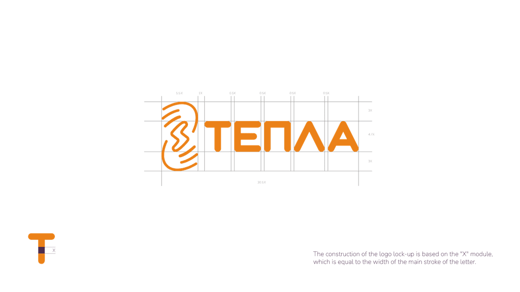
The lock-up of the "Tepla" company consists of a Logotype and a Brand Mark. As a Brand Mark, we use a stylized image of hands, which symbolize care and are placed in such a way that the negative space forms a lightning bolt as a symbol of energy.
The lock-up of the "Tepla" company consists of a Logotype and a Brand Mark. As a Brand Mark, we use a stylized image of hands, which symbolize care and are placed in such a way that the negative space forms a lightning bolt as a symbol of energy.
Construction
Construction


typography
Protective area
Protective area
colour palette


typography


colour palette


marketing materials
marketing materials


result
result
Brand Pioneering: Tepla's Journey to Recognition.
Brand Pioneering: Tepla's Journey to Recognition.
Tepla's new logotype and logo guidelines have successfully revealed the brand's visual identity, fostering a modern and sophisticated image that resonates with its target audience.
A friendly and welcoming personality for the Tepla's brand was created by developing a stylized image of hands, which symbolize care and are placed in such a way that the negative space forms a lightning bolt as a symbol of energy.


CLIENT TESTIMONIAL
CLIENT TESTIMONIAL
We got good results during this partnership, so we took Tarasenko Agency for the second project as well, which needed not only the logo but comprehensive branding services.
We got good results during this partnership, so we took Tarasenko Agency for the second project as well, which needed not only the logo but comprehensive branding services.
Sergey Kazantsev
CMO, Tepla
Sergey Kazantsev
CMO, Tepla


